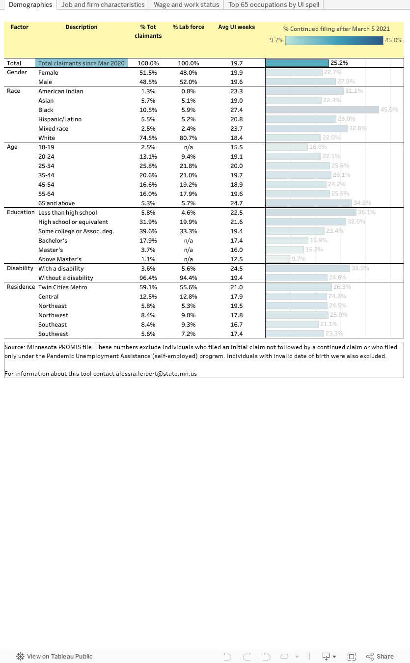
This dashboard presents three risk indicators which, when taken together, help identify which types of workers and sectors of the economy could be at higher risk of prolonged unemployment:
* Average UI weeks represents the average number of weeks of continued claims filed by each individual within each group from March 16, 2020 to the most recent time period for which data are available. Longer unemployment spells lower the probability of quick re-employment.
* Percentage still requesting benefits after March 2021 represents the share of claimants within each category who had not yet definitively returned to work by March 5, 2021. Industries with seasonal patterns of temporary layoffs followed by re-employment, such as Construction and Agriculture, cannot be considered at high risk of prolonged unemployment even though their shares might be high.
The dashboard also allows for comparison of the composition of claimants during the COVID period to that of the labor force and to the levels of claimants in the past two years in order to identify the most impacted demographic, occupational, and industry groups. Specifically:
* Percentage of Labor force represents the share of each group over the total 2019 workforce. When a group’s share of labor force is lower than the group’s share of total claimants it means that the group’s participation in UI is disproportionately large compared to the group’s labor force size.
All figures (except % labor force) are based on the 678,225 Minnesotans who filed a continued claim since March 2020. To help interpret the results, see this article by A. Leibert