by Dave Senf
March 2018
Income inequality has become a major topic over the past few decades as incomes have surged at the top end while wages for the middle class have stagnated. One measure of income inequality that has been around since 1912 is the Gini index or coefficient. A Gini coefficient, whether measuring the distribution of income or wealth, ranges from 0 to 1. A 0 coefficient denotes perfect equality while 1 represents perfect inequality.
The U.S. Census started to produce Gini coefficient estimates of household incomes for various geographies including state-level coefficient using American Community Survey (ACS) data in 2006. A state in which every household has the same income would have a Gini household income coefficient of 0, while a state where one household earned all the income would have a Gini household income coefficient of 1.
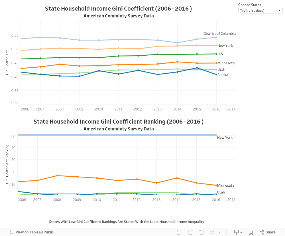
Below is a graph that shows the Gini coefficient for Minnesota and the U.S. and the two states with the lowest inequality in household income (Alaska and Utah) and the two states (D.C. and New York) with the highest inequality over the last decade. (Other states can be added to the graph by checking states in the Choose States option). Income inequality as measured by the Gini coefficients has increased in all states except Alaska between 2006 and 2016.
Minnesota, which had the 9th lowest level of household income inequality in 2016, saw its Gini increase by .0196 over the decade to .4496. The increase implies that Minnesota’s household income distribution became more inequitably distributed between 2006 and 2016. Minnesota’s Gini coefficient increase was slightly higher than the 0.0184 increase in the national Gini coefficient. The state’s 2006-2016 Gini coefficient increase was the 20th highest among states.
(Data is from the 2006-2016 ACS Table B19083 – Gini Index of Income Inequality)