by Amanda Rohrer
August 2015
Wage growth is one of the topics that is of most interest to people - after all, it has the largest single impact on workers. Unfortunately, it's difficult to measure. Workers rarely stay neatly in a single industry or occupation. The path to wage increases often involves a change in jobs - either a promotion that may change the job description or leaving a company for the challenges - new industries, new types of work. To further complicate the question, inflation changes the buying power of wages over long periods, and social policies and new technologies can change the value of benefits and further change the perceived wealth associated with earnings.
Teasing out the subtleties of wage gains can shed light not just on quality of life for individual workers, it can also have ramifications in the broader labor market and social climate. The skill level of jobs that are increasing in compensation can be reflective of the value of higher education; the wage level of jobs can shed light on income inequality and the ability to move up the income ladder; the industry or type of jobs with wage gains can reflect changes in demand and the broader value of a career track.
To really get at the impact of wage changes on individuals, we need to start with data that break wage data out by individual worker. The data set that best meets this need is the Occupational Employment Statistics (OES) program, which collects employee-level wage data from firms. To conduct this analysis, we started with the median wage for each of the 6-digit SOC occupations estimated by the program in 1st quarter 2001 (the first available) and 1st quarter 2014. Because the SOC coding structure changed in 2010, the BLS crosswalk was applied to the 2001 data to get comparable 2010 codes. The relationship between occupational codes is not one-to-one, however. Where more than one 2000 SOC code fed into a single 2010 SOC, employment was aggregated and wages were calculated as a weighted average. Where a 2000 SOC code fed into multiple 2010 SOC codes, 2000 employment was distributed based on 2010 ratios of employment for that set of SOC codes - for example, if a 2000 code was assigned to 2010 SOCs A, B, and C, with 2014 employment of 10 for A and 20 for B and 70 for C, then 10 percent of 2001 employment would be applied to SOC A, 20 percent to SOC B and 70 percent to SOC C. In that case, the full median wage would be applied to all three occupations. For a handful of occupations there was a many-to-many relationship between 2000 and 2010 codes - multiple 2000 SOCs fed into multiple 2010 SOCs. In those cases the ratio was calculated for each individual occupation and then employment was aggregated. Only occupations with data in both years, 2001 and 2014, were included in the analysis.
Despite the use of the crosswalk, not all employment could be converted perfectly. Final OES 2014 1st quarter estimated employment was 2,688,580. Matched 2014 employment used in the analysis was 2,446,680 - 91.0 percent of the total.
Once the final wage was calculated or assigned to the appropriate 2010 SOC code, wages were progressed forward into 2014 dollars using the U.S. CPI-U for 2014 annual and 2001 annual. This gives us comparable wage levels despite the 14-year gap.
The OES data are not intended as a time series, but comparing two relatively distant points in time can give us some inkling of how wages have or have not kept up with other changes in costs.
This analysis does not compare individuals to themselves - there is no link through time of the same people or even the same firms. What it does compare is the way a set of job duties is compensated and valued by the market through time - because the occupations are being matched by their consistent 2010 SOC code, the analysis directly relates the earnings of people performing the same kinds work at different points in time. The analysis does not try to extrapolate individual workers' wage experiences, but examining the relationship between relative wage gains and occupation can help us understand the occupation as a whole and its role in the labor market.
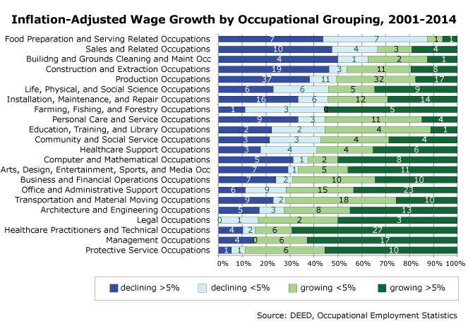
Of the 613 occupations included in the analysis, only 373 (60.8 percent) saw wage gains as adjusted for inflation. However, in the aggregate, gains outpaced the losses. Multiplying the annual numeric wage change by the number of employees yields an average wage increase of $1297.87 for each of the 2,446,680 jobs included in the analysis. Occupations with declines were concentrated in occupational groupings that are heavily low-wage. How much they grew or declined varied quite a bit, too - the chart below shows the difference between large (5%) gains and losses. Occupations in groupings that often require very high education levels - Healthcare Practitioners, Technical, Legal, Computer, and Mathematical, and Architecture and Engineering occupations - saw consistent growth and often very strong growth. Office and Administration, Business and Financial Operations, Healthcare Support, Education, Training and Library, and Community and Social Service occupations mostly increased, but by more moderate amounts. Some of the lowest-paid workers - Food Prep, Sales, Building and Grounds Cleaning and Maintenance - were most likely to see declines, especially significant ones. Management occupations saw the second-highest share of gains and many were significant. Protective Service Occupations had the largest percentage of occupations seeing gains. This may reflect the preponderance of government employment in this category, which is often more stable with wages. It's also a very small occupational grouping, housing only 1.7 percent of employment in 2014.

One of the disadvantages of examining wage growth for each occupation separately is that some occupations employ very few people, and some are very abundant. Examining wage growth by employment in an occupational grouping changes the picture somewhat.
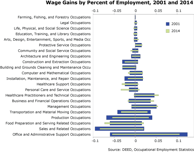
In the chart below the length of the bars is the percentage of employment in a given occupational grouping. The green bars are 2014, and the blue bars are 2001. The amount to the right of the axis indicates the share in occupations with wage growth, and the amount to the left of the axis indicates the share in occupations with wage declines.
Personal Care and Service Occupations, Healthcare Support Occupations, and Food Preparation and Serving Related Occupations all stand out because not only do they employ a larger share of the pool of workers in 2014 (the overall length of the bar has increased), but the occupations with declining real wages are employing a larger share of the occupational grouping's employment (the green bar sticks out further to the left). In contrast, Healthcare Practitioners and Technical Occupations employ more people, but most of them are in occupations that are more highly paid in real terms than they were in 2001. Office and Administrative Support Occupations still employs the largest share of Minnesota workers, but it's declining, and a disproportionate share of those declines seem to be occurring in occupations that have seen inflation-adjusted wage gains since 2001.

Although it's apparent from occupational groupings discussed above that most of the declining wages are in low-skilled occupations, it's also useful to group occupations by wage, as well. Grouped by income bracket, there are many more low-wage jobs that have seen a decline in real wages since 2001.
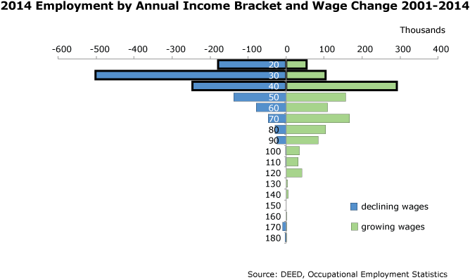
In the chart below employment for 2014 is displayed by income brackets labeled by their upper threshold. The income bracket with annual earnings of up to $20,000 had 230,000 workers in 2014 - 180,000 in occupations that were paying less in inflation-adjusted dollars than in 2001, and 50,000 in occupations that were paying more. The bars highlighted with heavy outlines are moderate-income brackets - those earning $40,000 and less.
There's a clear pattern that the lowest-paid jobs are those that are least likely to have wage gains that keep pace with inflation. In contrast, nearly all of the jobs paying more than $40,000 have seen wage gains since 2001, and for each bracket up, the share of jobs that have seen wage increases is greater. This suggests a widening gap between the affluent and the struggling, those with years of post-secondary education and those without.

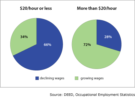
A similar pattern is apparent in hourly medians. The percentage of employment in occupations where wages have declined is 66 percent for those paying $20/hour and less, but only 28 percent for those paying more than $20/hour.

Overall, wages are higher than they were in 2001 even after accounting for inflation. However, well-paying high-skilled jobs are compensating workers more, while low-wage and low-skill jobs in Food Service and Personal Care and Healthcare Support are paying less in real terms in 2014 than they were in 2001. This trend may be changing - recent increases in the minimum wage would not yet be reflected in this data set.