View: Home | Data Tool | About | National Data | How to Analyze | LMI Help
One much-watched indicator of labor market conditions is the number of initial claims being filed for unemployment benefits. Not all laid-off workers file claims for benefits, and not all claims are filed by people permanently separated from their jobs, but the number of claims filed does provide a reliable and timely measure of the trend in layoffs. Their significance as an economic indicator is often demonstrated by the attention given the weekly release of national claims data every Thursday1, and is also illustrated by their inclusion in the Conference Board's Index of Leading Indicators. Although the level of claims and the information on the pace of layoffs that it provides is only one side of the net job growth equation, with the rate of hiring being the other, we will see below that the strong relationship between claims levels and employment growth supports their usefulness as a guide to labor market performance.
One difficulty in using these data, though, is the highly seasonal characteristic of unemployment claims. Due to recurring events such as Minnesota winters, the holiday shopping season and the school year, some months consistently have much higher claims levels than others. This can make it very difficult to discern whether an observed month-to-month change is a natural seasonal occurrence or is due to a real change in labor market conditions. In the past, the Labor Market Information Office at the Minnesota Department of Employment and Economic Development (DEED/LMI) has adopted the practice of comparing monthly claims to the same month of the previous year. While this provides an apples-to-apples comparison, it has the limitation of identifying only those changes that occur over a full year. Often, shorter comparison periods are needed. In order to use initial claims data to identify shorter term changes in labor market performance, DEED/LMI is now producing a seasonally adjusted monthly initial claims series2, extended back to January 1950. The purpose of this comment is to describe some of the salient features of these data as an economic indicator.
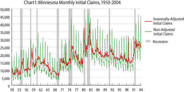
Chart 1 presents the raw or unadjusted level of initial claims as well as the seasonally adjusted series. The unadjusted data illustrates the highly seasonal fluctuations, with the spikes occurring in December or January each year and the trough usually occurring in September. One can also see a secondary spike in June. But the difficulty in using these levels to identify trends is apparent - raw claims frequently triple between September and December as a result largely of construction and retail lay offs even during periods when labor market activity is strong (for example, during the 1990s). The seasonally adjusted series, on the other hand, quite clearly removes the recurring spikes and troughs to produce a level that can better identify the ebbs and flows in cyclical economic activity. We can clearly see, for example, the surge in claims as the state and nation entered recession (as shaded in gray) and the subsequent drop in claims levels as the economy went into recovery.
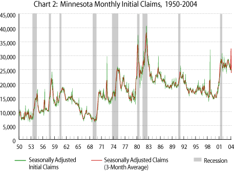
However, even after seasonally adjusting these data, volatility resulting from unusual events may still obscure trends. The spike in 1998, for example, results from the effects of the NWA pilots' strike, and the construction workers' strike in 1972 is also apparent. Smoothing the series by calculating a 3-month moving average, much as the Department of Labor does with their weekly claims series, provides further clarity of longer-term trends in claims levels. The result of this smoothing is illustrated in Chart 2.
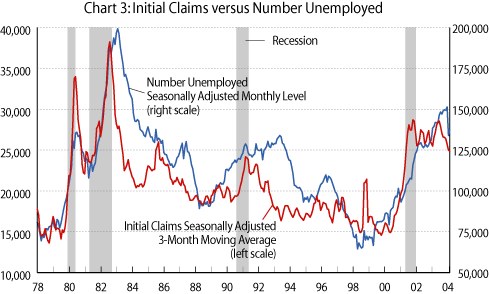
The usefulness of this seasonally adjusted moving average of monthly initial claims can be seen when it is compared to other common measures of labor market performance. Chart 3 plots these initial claims alongside the seasonally adjusted number of unemployed people in the state each month (monthly state data on the number unemployed are available back to January 1978). The tendency for these to move together is obvious, but the chart also demonstrates that the number unemployed lags the number of claims, especially at those turning points when the economy is coming out of a recession. Thus, claims can be used as a "predictor" of eventual improvements in unemployment.
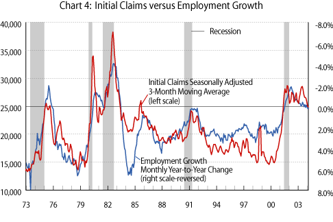
Chart 4 depicts the same type of correlation in trends between initial claims and annual over-the-year employment growth (the scale on the employment growth axis is reversed since claims and employment move in opposite directions) from 1973 to the current period. Here again, we can clearly see the utility of claims data as an indicator of job growth and labor market performance. Claims and employment growth are more coincident in their turning points than is the case with the number of unemployed, so using claims as a leading indicator of employment may appear less likely to be fruitful. However, a useful correspondence shown by this chart is the near-perfect match between movements from positive to negative employment growth (and vice versa) and the number of claims crossing 25,000. In other words, in each of the four recessions when state employment declined (it didn't do so in 1990-1991), the number of monthly claims surpassed 25,000 between one and three months prior to the state's employment growth turning negative.3 Coming out of the recessions of 1974 and 1982, employment growth turned positive two months after claims fell back below this 25,000 per month threshold. So, indeed, this level seems to provide a very useful barometer of turning points in employment growth, much as the frequently-referenced threshold of 400,000 weekly claims does for the nation.
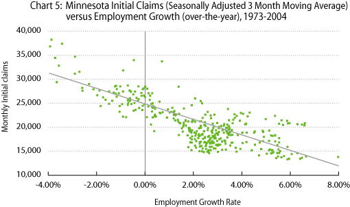
An alternative representation of this relationship is given in Chart 5, which plots monthly claims against employment growth between 1973 and 2004. Included in the chart is the line which "best fits" this relationship - note that the level of claims corresponding to zero employment growth is just under the 25,000 threshold (actually at 24,200) and that positive growth is associated with levels below this threshold. While clearly this is not a precise cut-off in all instances (although the relationship with employment growth explains over 61% of the variation in claims levels), it does further validate the use of 25,000 per month as a good "rule of thumb" guide regarding labor market trends.
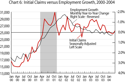
It is informative, then, to consider recent labor market performance in light of these new seasonally adjusted data and this "rule of thumb". Prior to the onset of the recent recession, seasonally adjusted claims levels bottomed out at below 15,000 per month in late 1999 and again in mid-2000. They then began to climb until they exceeded 24,000 in April of 2001, and hit nearly 29,000 in May, as is seen in Chart 6. Subsequently, March of 2001 was declared the official start of the recession, two months prior to claims hitting the 25,000 threshold, and over-the-year employment growth turned negative in July, 2 months after claims surpassed 25,000. Claims levels reached their highest level in October of that year, at 30,882, in large part as a result of the impact of the 9/11 attacks on the travel industry. They then remained above 25,000 for 22 of the next 24 months.
During the five months between November 2003 and March 2004, the level remained in the 24,500-to-25,500 range, although close enough to the low end of the range to bring the 3-month moving average below 25,000 as of January. Over-the-year employment growth turned positive, barely so but nonetheless perhaps permanently, as of December, one month prior to the moving average claims level breaking the threshold. So here again we are seeing a close correspondence between claims slightly below 25,000 and employment growth slightly above zero. At the time this is being written, we now know that April's claims level has dropped precipitously to 21,438. We will know how this translates into job growth later in the month, but it would be surprising, given our analysis here, if this level of claims did not coincide with some significant improvement in employment. This will certainly give us a good test of the usefulness of our new rule of thumb. Given our goal of providing the best information possible and the difficulties we (and all other economic prognosticators!) have had in predicting labor market conditions, this is indeed a welcome addition to our kit of analytic tools.
1The release on Thursday, March 25, for example, was described by CNN as "An optimistic job signal? With average weekly claims at 3-year low, there's some sentiment big employment gains are coming."
2The procedure adopted by LMI is the X-12 ARIMA process with controls for the number of trading days during each month. This is the process used by the Bureau of Labor Statistics, the Bureau of Economic Analysis, and the Census Bureau to remove seasonal effects from data that each of these agencies produces.
3While this relationship holds up for the post-1973 period, a smaller labor force prior to 1973 results in lower claims levels being associated with changes in the direction of employment growth. For this reason, the chart depicts only the 1973-2004 period.