by Luke Greiner and Dave Senf
April 2015
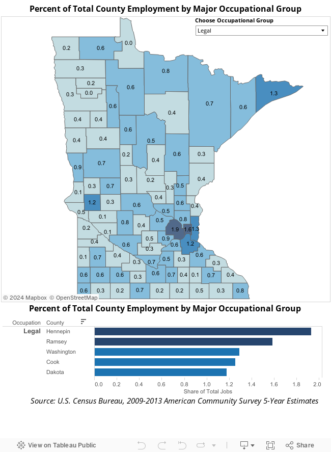
Feel all alone in your job? Think again! Using American Community Survey data from the U.S. Census Bureau, you can see the share of workers by county in the same occupational field.
Aside from preventing work loneliness, there are many organizational strategies that can be pursued by knowing occupational densities. On one hand, high occupational density might entice a company with similar jobs to tap into an existing workforce that's highly skilled in the areas they need. On the other hand, the high concentration might indicate that the available labor for a specific occupation is tapped out, with little room for expansions or new competitors.
The chart below lets you select an occupational group from a drop down list in the upper right hand corner. Click on any of them and watch the county percentages change on the map as well as the bar chart under the map.
If you can't get enough fun with statistics and want more information contact your regional market analyst.